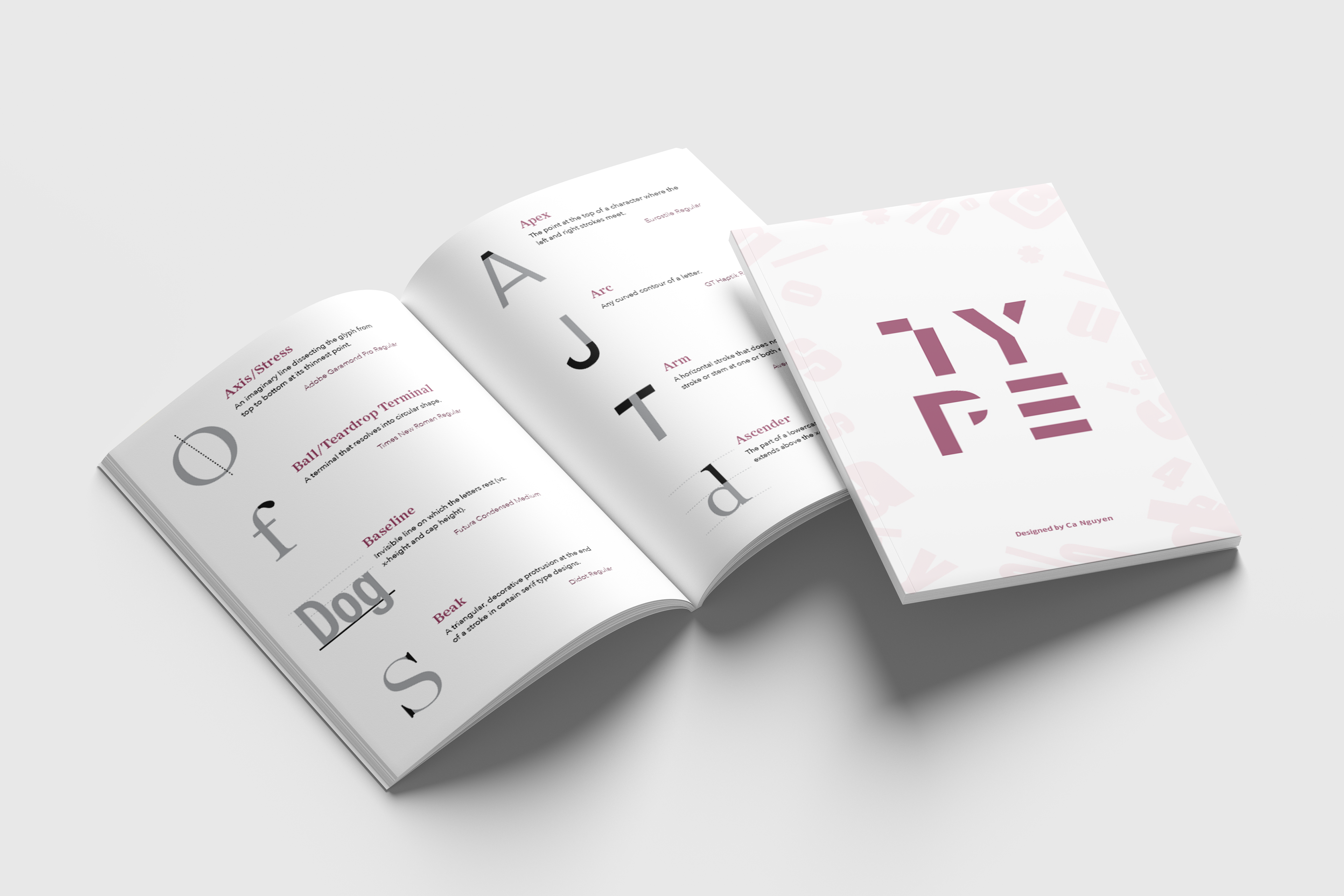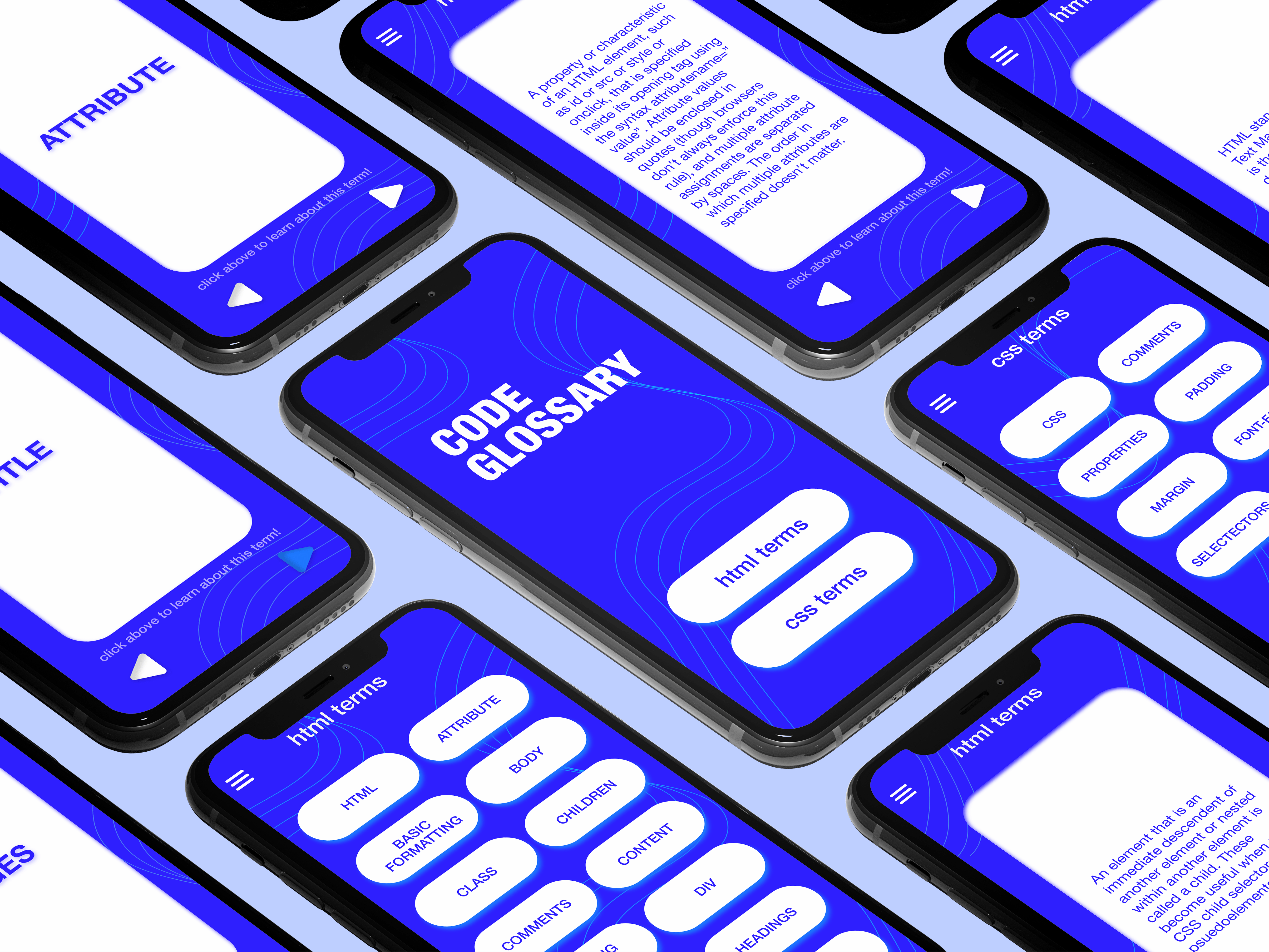
For our assignment, we were tasked with crafting a comprehensive glossary comprising 64 typography terms. Utilizing provided text and images, I employed InDesign and Illustrator to develop a unique typography style. Additionally, I designed the book cover for this encompassing design system.
My goal was to create a design that is both simple and easy to read while maintaining an aesthetic and eye-catching appeal.
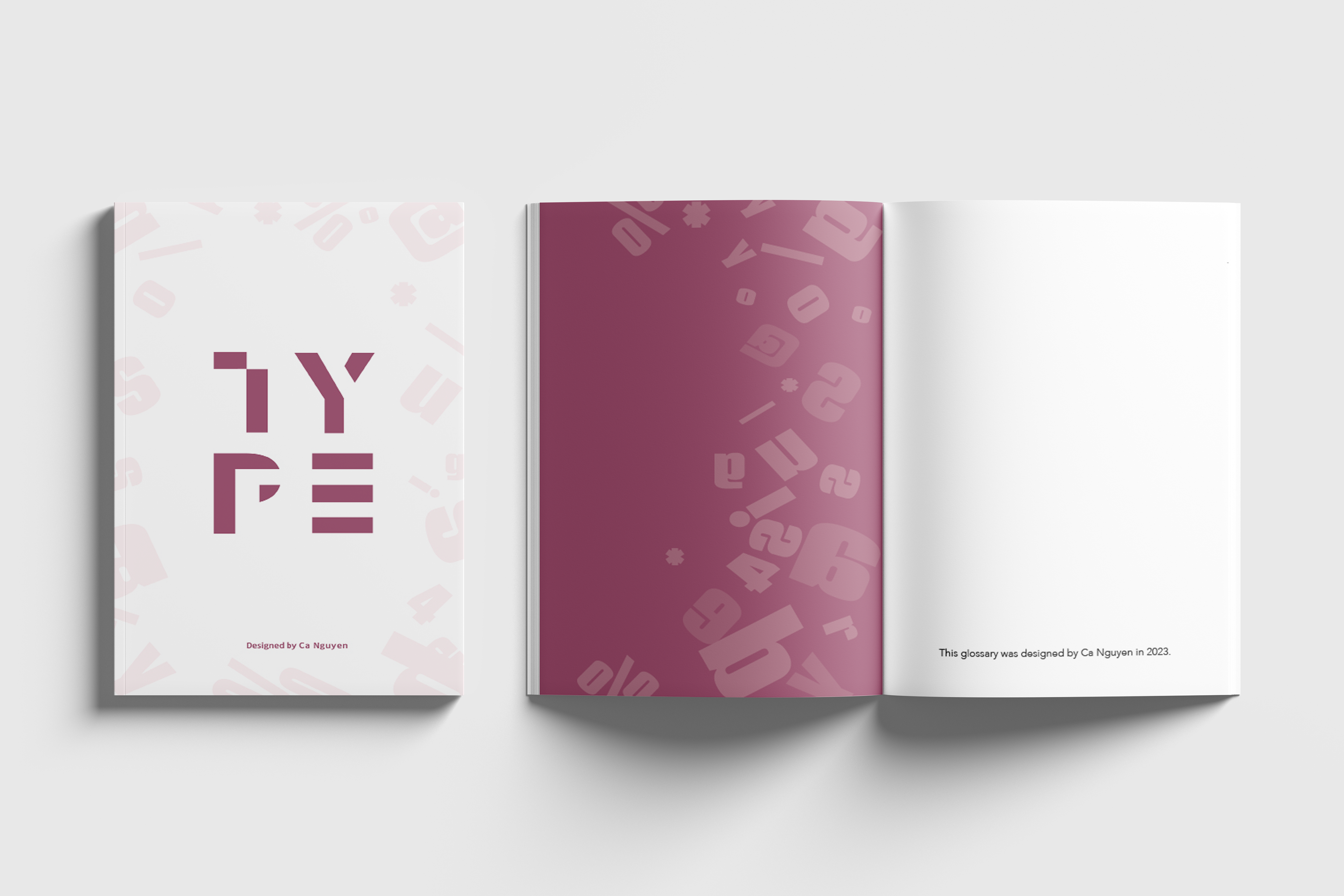
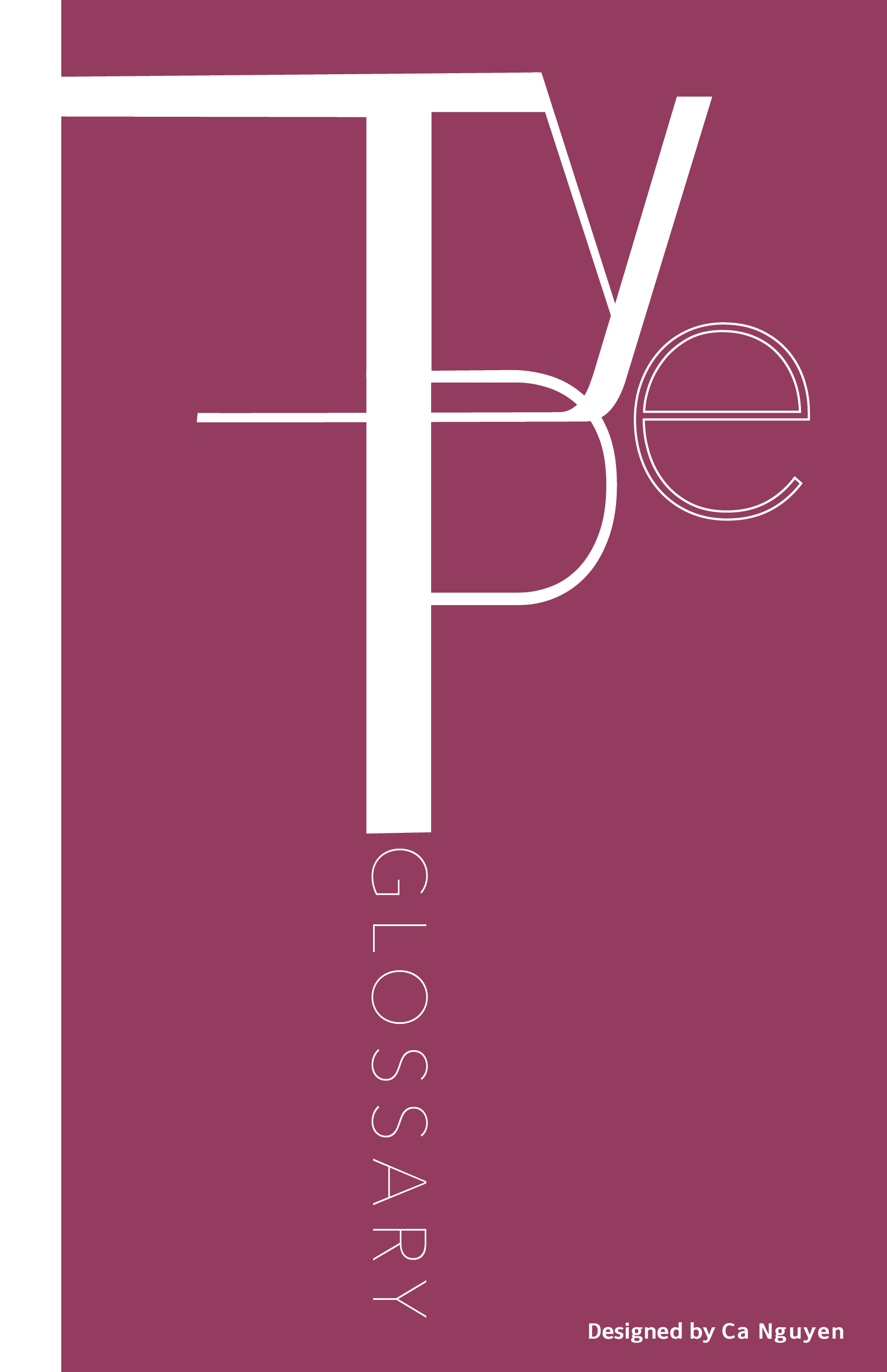
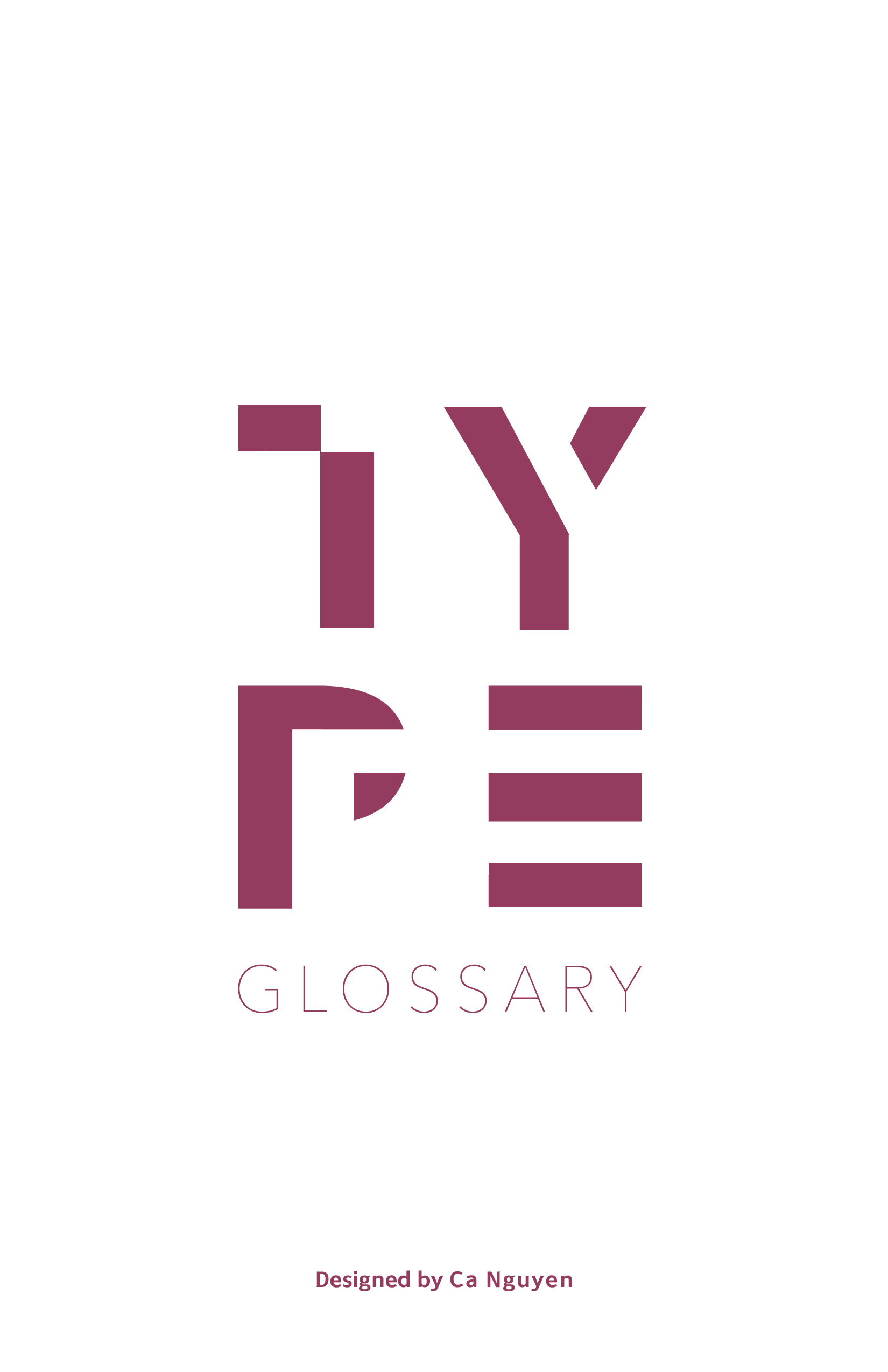
Building upon the color theme chosen for the title text, I extended the aesthetic to enhance the cover page of the glossary. The requirements included incorporating "Typography Glossary" and my name on the cover. To achieve this, I opted for an all-uppercase "TYPE" and transformed "glossary," "design," and additional initial letters and symbols into a pattern in a lighter color tone. This serves as the final design decision for this assignment, adding a distinctive and visually appealing touch to the cover.
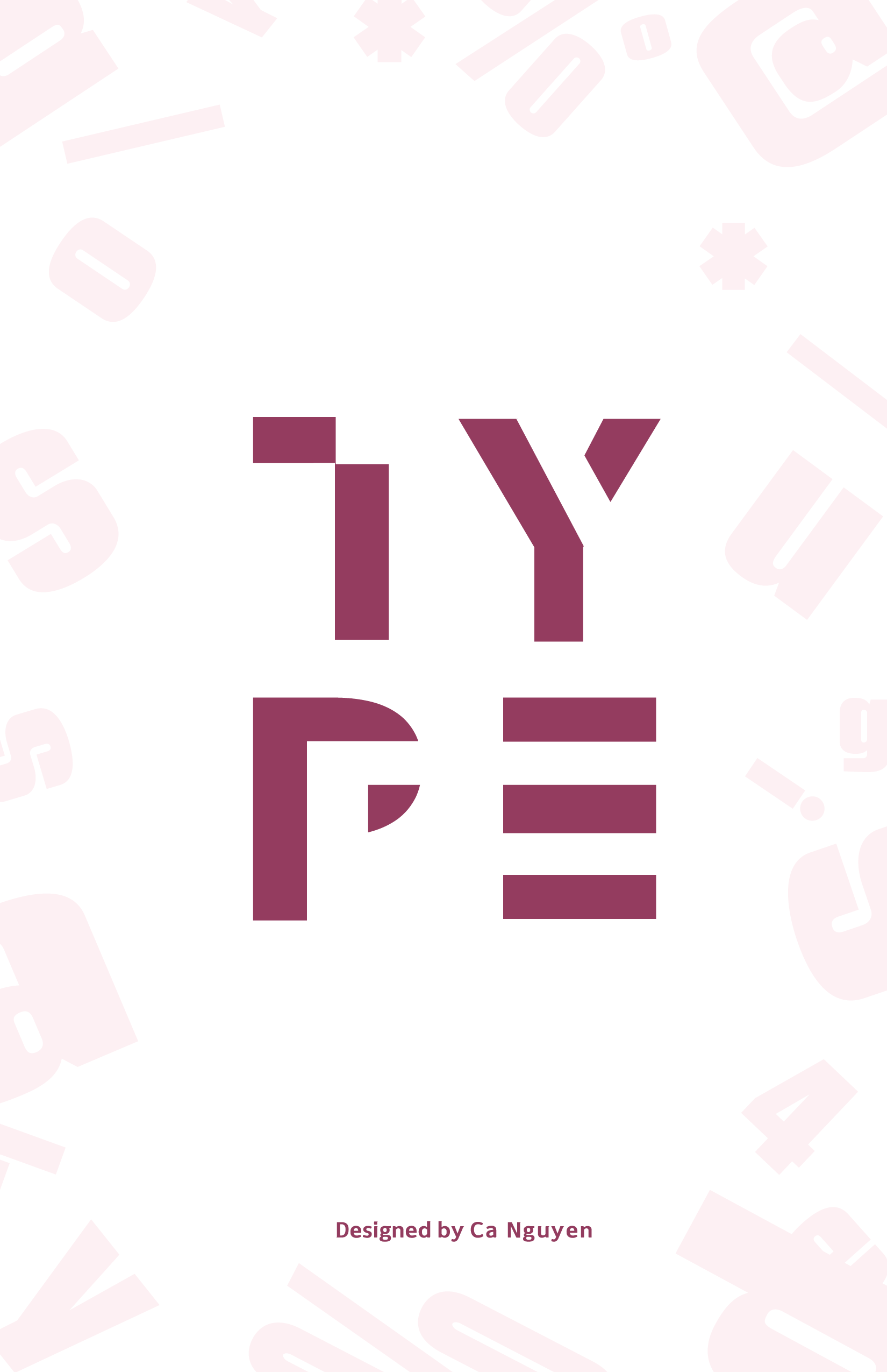
Final cover design
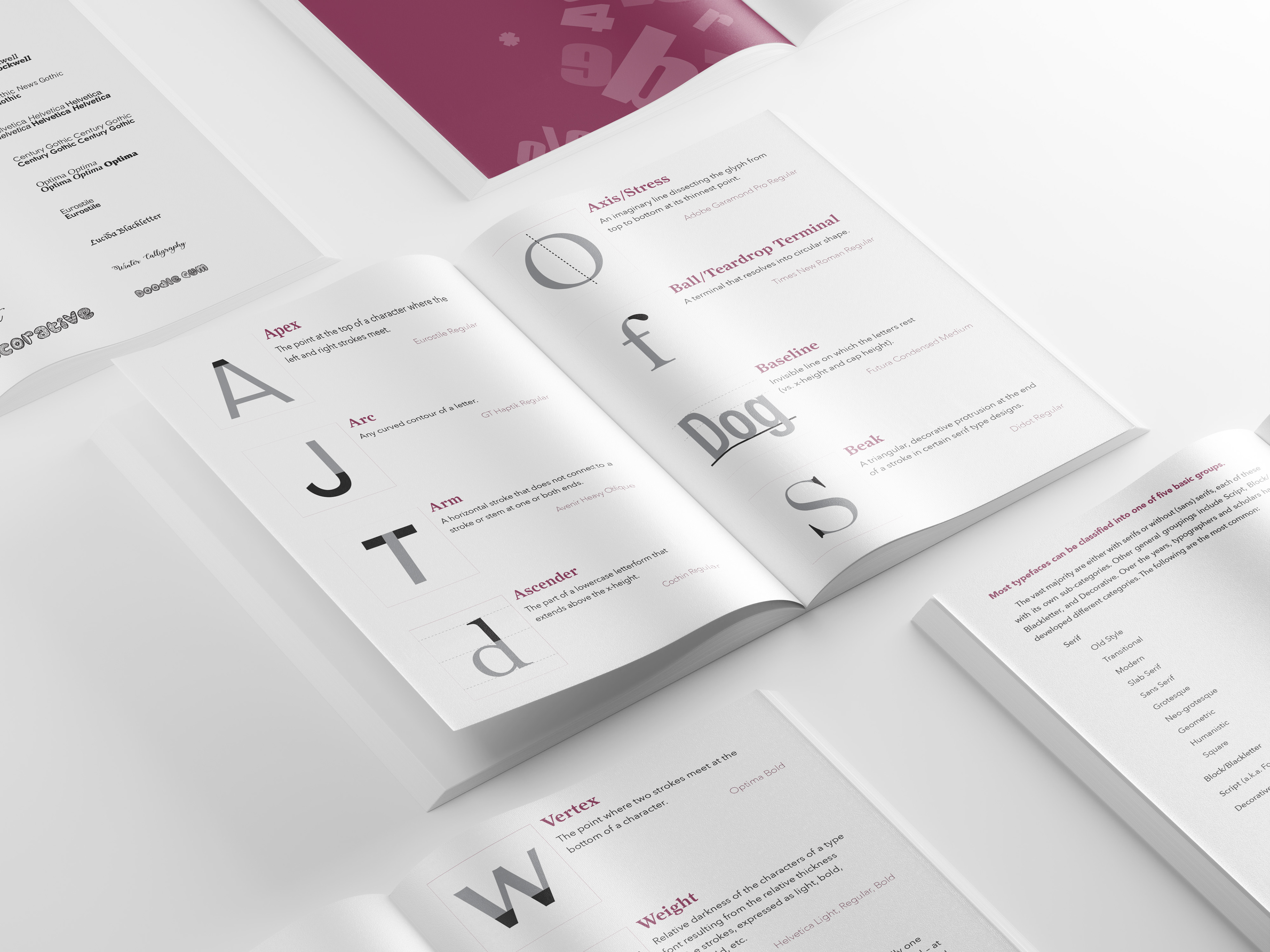
As I mentioned earlier, my objective is to create a glossary that is both simple and readable while maintaining an aesthetic appeal. To achieve this, I strategically placed images parallel to the descriptions, enhancing visual understanding. The text alignment is set to the left, providing a well-balanced layout on an A4 paper, optimizing both functionality and aesthetics.
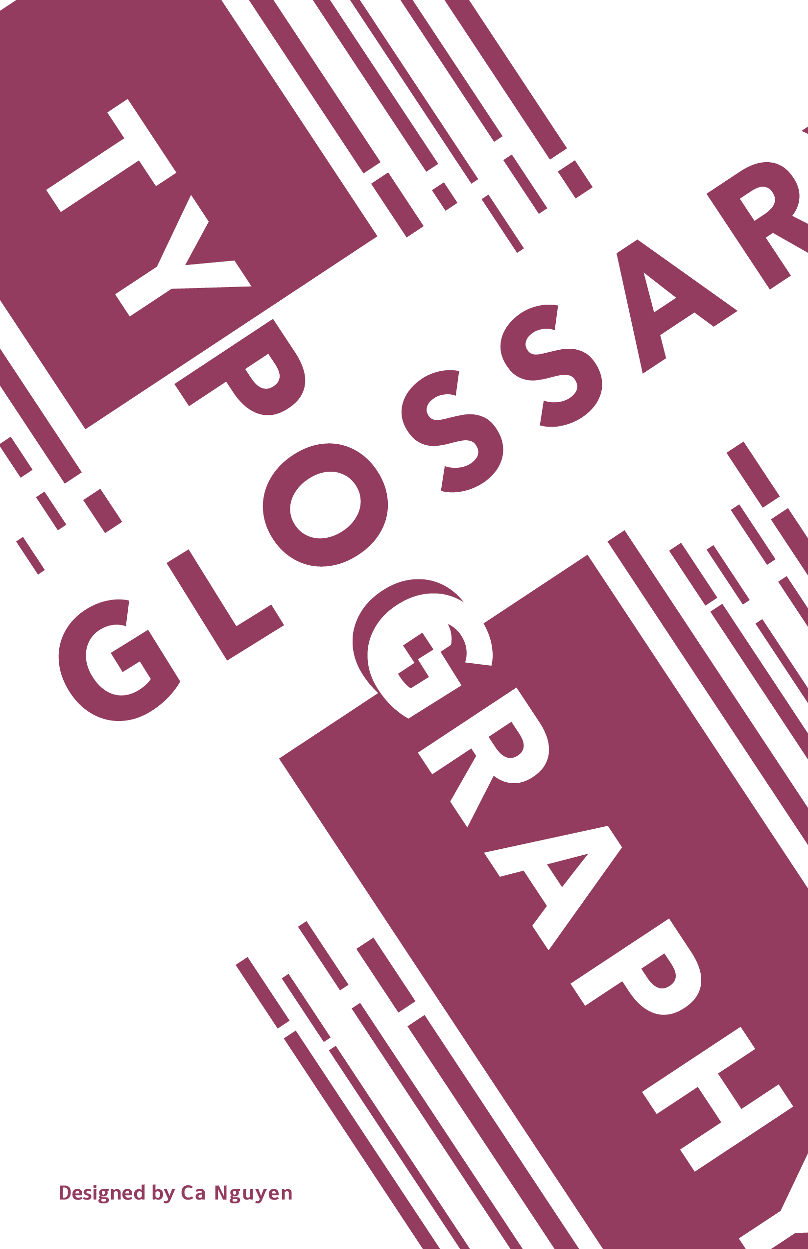
Cover sketches
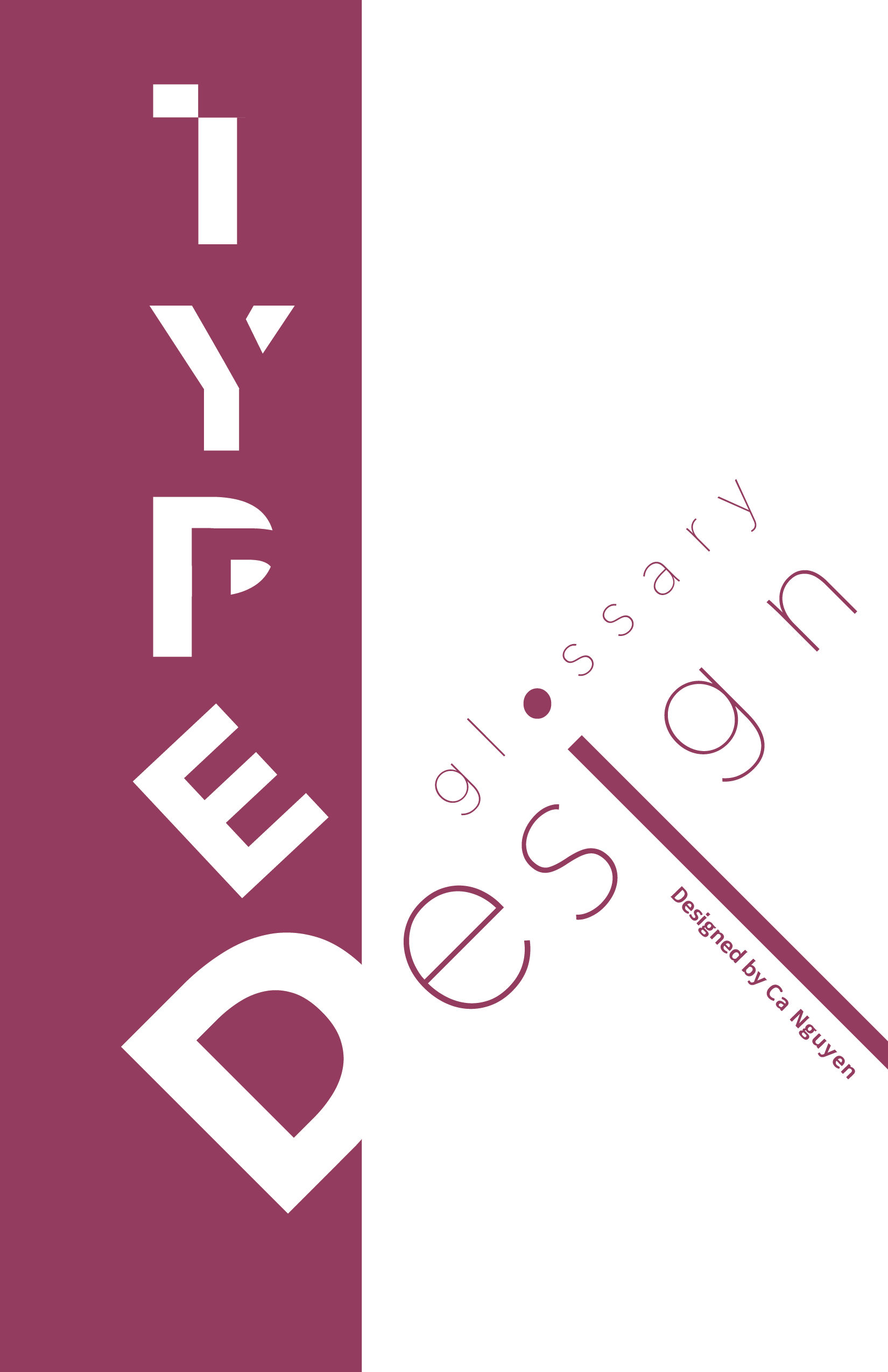
Building upon the color theme chosen for the title text, I extended the aesthetic to enhance the cover page of the glossary. The requirements included incorporating "Typography Glossary" and my name on the cover. To achieve this, I opted for an all-uppercase "TYPE" and transformed "glossary," "design," and additional initial letters and symbols into a pattern in a lighter color tone. This serves as the final design decision for this assignment, adding a distinctive and visually appealing touch to the cover.
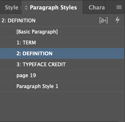
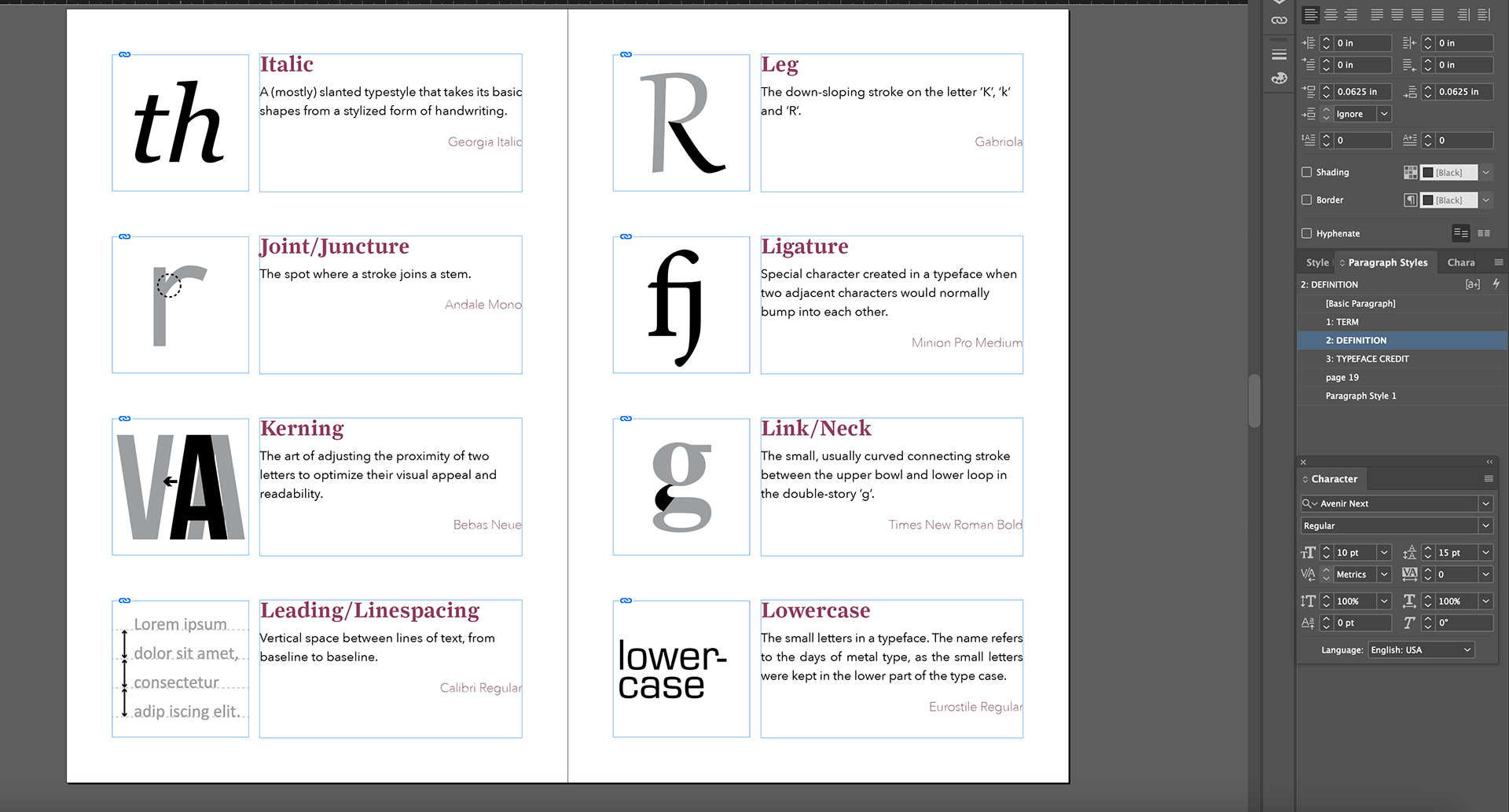
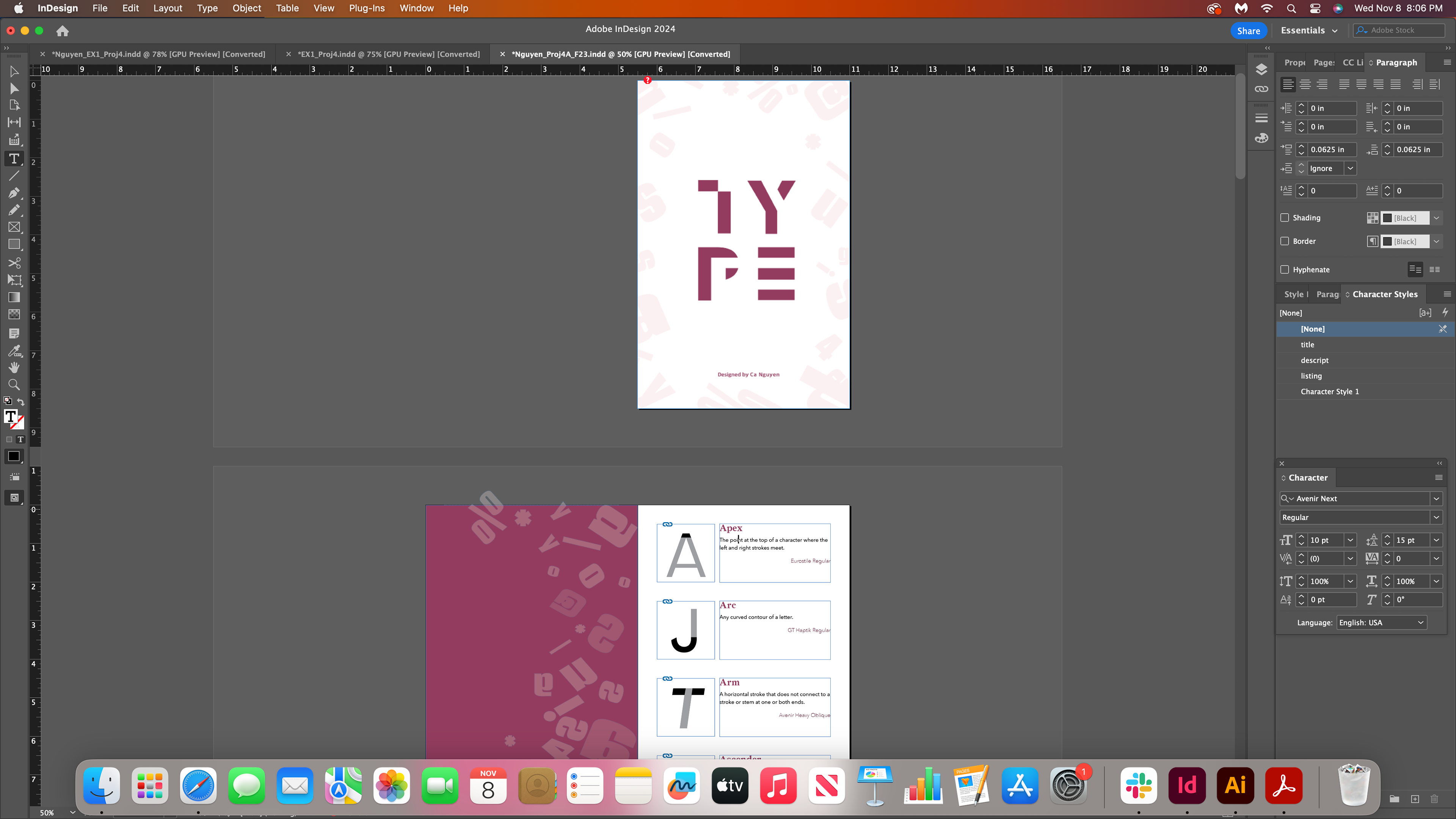
Paragraph style set up and page lay out
After going through various design processes, the next step involved presenting it in a spread format for a proper printout. Ensuring that the color printed as expected was a crucial aspect of this phase. I encountered challenges in post-printing, particularly with the texture of the spreading paper. This experience taught me valuable lessons, from correctly setting up paper spreads to ensuring a proper fit after printing. The meticulous consideration of the number of pages in the design also played a significant role in the final outcome.
This project was a substantial undertaking that demanded considerable effort, and the learning outcomes have been immensely rewarding. I've developed a deeper understanding of typography in design, recognizing the critical importance of visual weight and space. Additionally, I honed my skills with Adobe InDesign and Illustrator, which served as my invaluable partners throughout this creative journey.